In the realm of filmmaking, every element – from cinematography to set design, and costume to color grading – shapes the narrative and evokes specific emotions in the audience. Spike Jonze’s 2013 masterpiece, “Her,” is a prime example of how color can be harnessed as a powerful storytelling tool. The film’s distinctive color palette not only complements the futuristic setting but also reflects the emotional journey of the characters, particularly the protagonist, Theodore Twombly. In this blog post, we’ll delve into the “Her” movie color analysis, exploring how the filmmakers’ strategic use of hues and tones enhances the storytelling and resonates with viewers on a profound level.
What makes “Her” an immersive experience?
To answer this question, we need to look at it from the perspective of an audience to see what elements make him emotionally understand the story. As the audience starts to watch, the first thing that brings him in is the exposition of the film which tells him about the setting, characters, mood, and all the other information that he needs to know at this stage of the film to enter the story.
In fact, story is the cornerstone of the film and every other element helps the audience to better experience the story. Elements like dialogues, locations, soundtrack, and Visual Rhythm play together. Although we think of rhythm as the sensory data derived from the sound of the film and perceived by our auditory system, there is another type of rhythm that is evoked by the visuals of the film and is perceived by our image analyzers subconsciously. And that concealed rhythm is embedded in Colors.
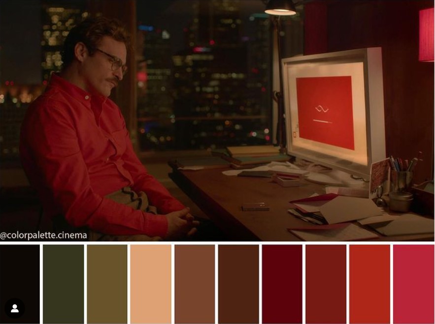
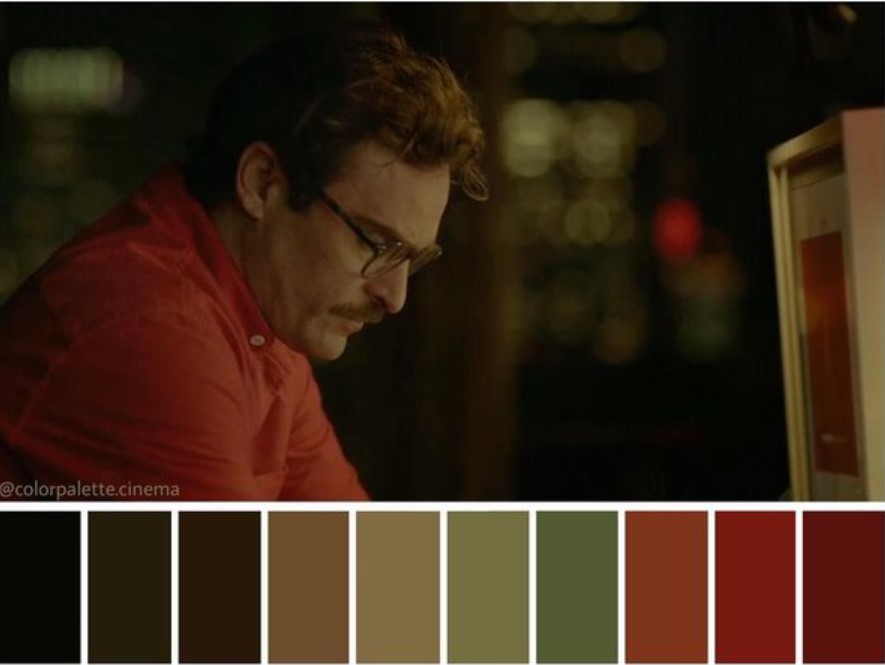
As the audience walks through the story, one of the most important elements that tell him what to feel are the colors. Colors contain feeling and meaning and together with other elements, make an immersive world around the story. Look at the different shades of red color in the movie, Her. they’re telling the viewer about isolation, loneliness, the emotional state of the character, and his desire for love. And then there is Samantha (Scarlett Johansson), a new possibility for care and love, which is also associated with red.
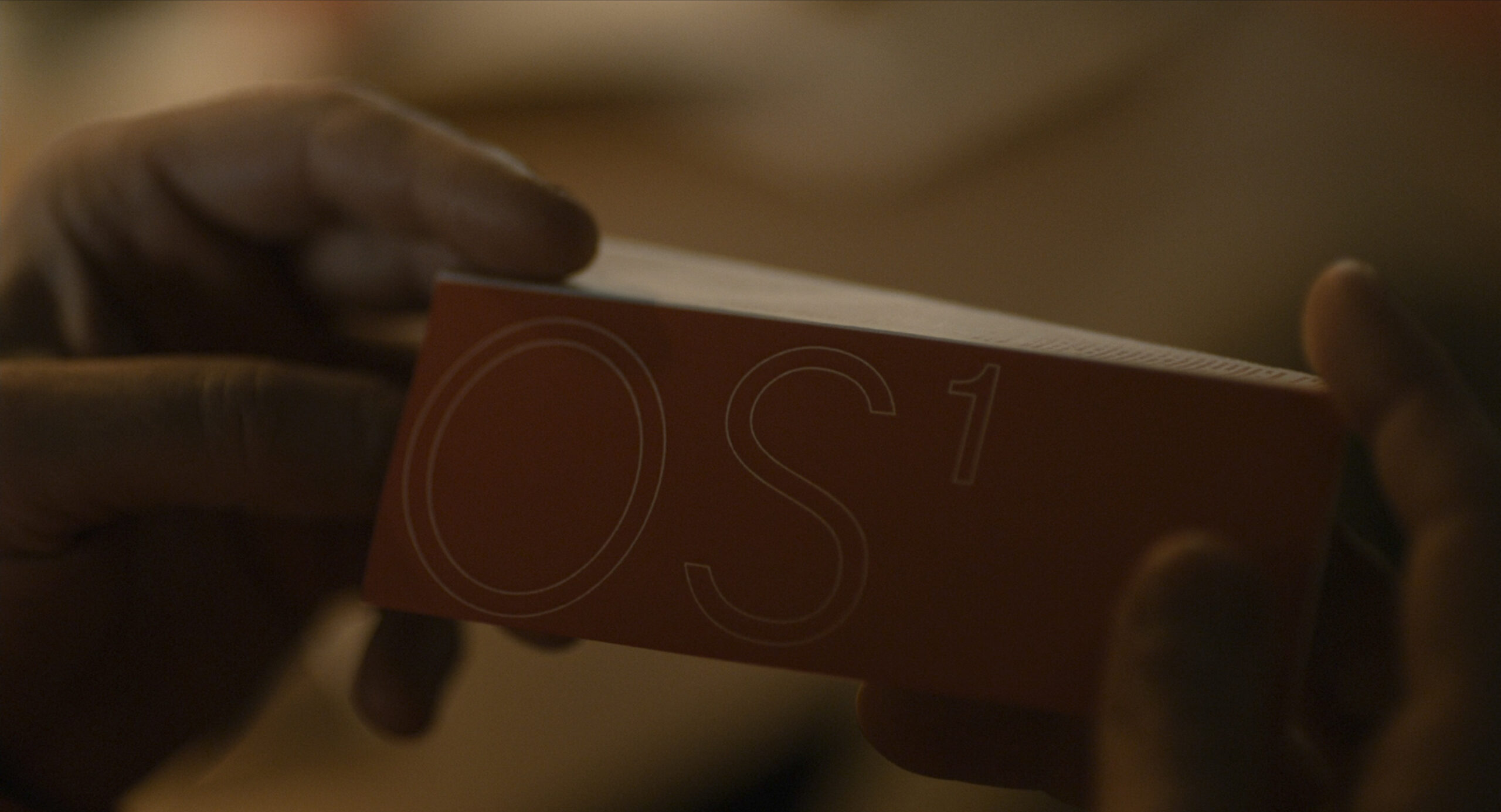
Red Color Associated With Samantha
The color red is almost everywhere in Theodore’s life, from his office to his apartment, you can see different shades of red, placed beautifully around him. There are scenes that using red, tells us there are other people in the same situation that the main character is in. a message that gets unfolded when he realizes that there are others with the same relationship he has. But the key to using one specific color throughout the film without overusing it is to balance it, scene to scene. there are scenes with lots of red, and there are other scenes that balance the use of red by limiting it to one or two little spots.
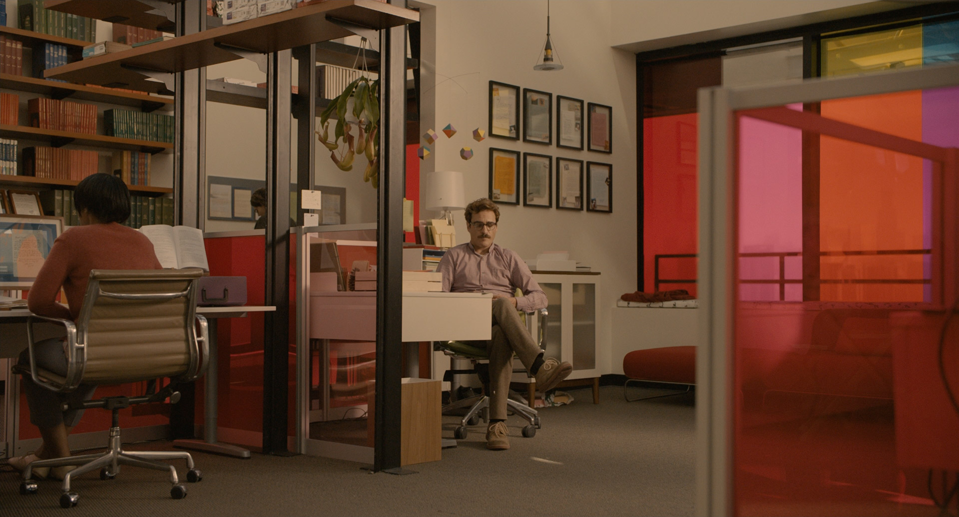
Theodore’s life Surrounded By Red and Pink
So when an audience is watching a movie, colors that are mostly used in the film, create a palette together. And that color palette creates a rhythm that aligns with the wave of the story. Colors can tell us about the mood of a scene. They can tell about the personality and the inner world of the characters. What they are like, what they want, and even talk about what they’ve been through. Colors can also intensify the flow of the story and the changes that happen to form the plot and make them more understandable. They create associations with meanings, again, like in this one, red for love, and the absence of red, for the absence of love.
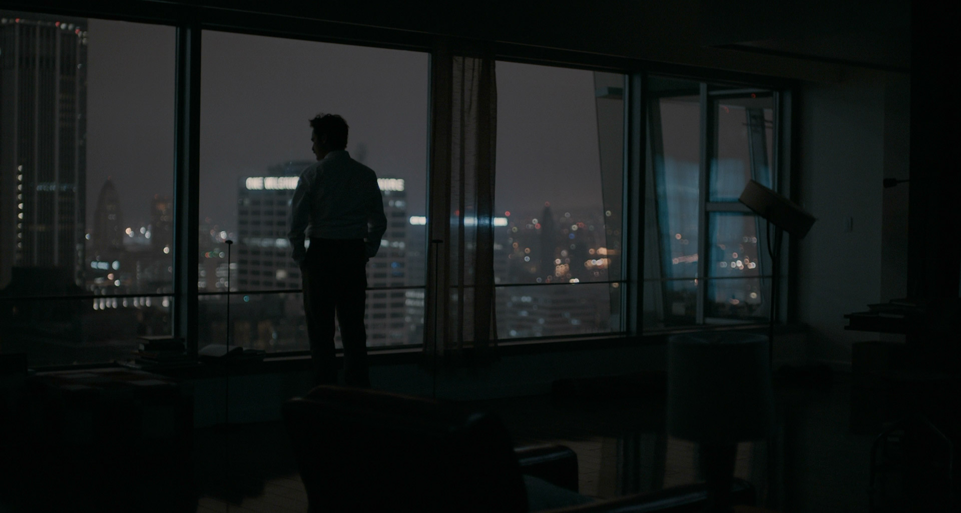
The Absence Of Red For The Absence Of Love
So colors are important in the process of filmmaking as they can retell the story on a subconscious level. Roger Deakins the director and oscar-winning cinematographer says: “It’s easier to make color look good, but harder to make it service the story.” That is why Pixar creates a “color script” for each film to map out the hues for all scenes to match the visuals with the story arc and make key moments feel appropriately vibrant or somber.
The Cool Tones of Blue and Green
While the warm tones dominate the films overall color scheme, “Her” movie color grading also incorporates cool hues like blue and green, which serve as counterpoints to the passionate reds and pinks. These cooler tones often appear in scenes depicting Theodore’s isolation and loneliness, such as his dimly lit apartment or the stark, impersonal offices where he works.
The juxtaposition of warm and cool colors creates a visual contrast that mirrors the internal conflict Theodore experiences – his desire for love and connection clashing with the detached, technology-driven world he inhabits. This interplay of hues adds depth and complexity to the storytelling, allowing the audience to viscerally experience the emotional turmoil Theodore grapples with.
Conclusion: Her color analysis
Spike Jonze has created a masterclass in the art of color storytelling. From the warm, passionate reds and pinks to the cool, isolating blues and greens, and the muted, futuristic tones that pervade the film’s world, every hue and shade serves a deliberate purpose. The “Her” movie color palette not only immerses the audience in the film’s visual aesthetic but also serves as a powerful narrative tool, reflecting the emotional journeys of the characters and the thematic undercurrents that give the story its depth and resonance.


